Showing posts with label painting. Show all posts

Friday, March 21, 2014

In my little corner

The large majority of my time these days is spent in my little corner of the room for the performance costume 4th years and masters students (of which there are two), trying to make up for an unfortunate lack of real productivity earlier this semester.  At the moment I have quite a lot of projects 'in progress', and am slowly chipping away at the list of things to get done.


First priority for the rest of the semester is finishing all the final costume illustrations for The Girl Without Hands.  I've decided to do them on illustration board, and start with a pencil drawing which then gets set with fixative and varnished so that I can paint on top.  I just do a simple wash of acrylic to tone the board, and then use thin layers of oil paint on top.


(this one was sort of at the half-way point here)

I've also started mocking up and making costumes for the main character, and am aiming on having three toiles and at least one finished final costume by the turn in date in May.  In spite of not having masses of time at my disposal, I'm still doing quite a bit of hand stitching on the final pieces... such as the shift currently on the stand.  After all, there's nothing quite like focusing on hand work for some quality stress relief!


Monday, October 21, 2013

Determining the palette

One of the best ways to achieve consistency in either a single painting or in designing an entire show, is to decide on a palette of colors to utilize, and then to stick to that palette.


I'll be doing the actual costume renderings (illustrations) in graphite and oil paint, so it made sense to use oils now when simply playing around with color.  And this way I'll know exactly what colors to mix with and restrict myself to when I actually do the renderings.  I could probably limit my initial palette even more, but I shouldn't get too crazy using these: Titanium White, Cadmium Yellow, Yellow Ochre, Cadmium Red, Venitian Red, Burnt Umber, Ultramarine Blue, and Cerulean Blue... I like to mix my own black using equal parts Burnt Umber and Ultramarine Blue.

My main visual inspiration for overall color themes was a photo of part of the ceiling and a chandelier in Versailles.  I printed the photo out, pasted it to a sheet of paper canvas, and painted swatches around it.  Some of the swatches I painted over several times, and I'm still not %100 sure the palette here is final, but this the general direction I want to take it.  (adding, of course, metallic gold and silver... lots and lots of gold and silver)


Sunday, January 6, 2013

This time on ivory

While I'm catching up a little on projects I finished a while ago, I thought I should probably post about a portrait miniature which I painted last spring.  Aubry, a truly lovely historical costumer, had contacted me about doing a miniature of her husband in late 18th century style and clothing.  This gave me the opportunity to paint a miniature on actual ivory, something I'd not before attempted.

Painting on ivory was definitely an... experience.  As much as I thought polymer clay wasn't absorbant, ivory was even less so.  Very, very slick.  After a bit of trial and error, I found that the best way to apply the paint was in very tiny, little brush-strokes.  A sort of stippling in tiny lines instead of dots, if that makes sense.


I can totally see how one would need all the years of an apprenticeship to be able to call one's self a miniaturist!  The skill is definitely one that requires practice.

Friday, August 31, 2012

Deep inside the comfort zone

When some people are melancholy they tend to comfort eat.  I, on the other hand, go off my food and instead comfort paint.

Even if I have a mountain of things which really Need To Be Done, I'll set it all aside and paint something familiar and easy and mindless with no other intent than to be doing.  I'm not trying to make great (or even good) art.  Most of the time it's a small-ish oil painting... there's something very soothing about mixing colors and the physicality of manipulating paint, without having the pressure of meeting any sort of expectations.

Here are a couple "comfort paintings" which I did recently.  Both are about 9x12 inches.  Neither are terribly good, but I kind of wanted to share this side of myself anyway.

One of these days I'll stop being obsessed by Bill Kaulitz's face.  Maybe.  But until that point, images of him will always make me feel better.

And this one was based off a stock image which I'd found on deviantArt.  It's kind of hard to not relax when drawing/painting pretty girls.  Although I suppose this one ended up a little bit dark.

Like I said, no real thought behind either painting, and they clearly show what I'm super comfortable painting... people/portraits/no-real-background-to-speak-of.  The 'comfort zone' is called that for a very good reason.

Wednesday, July 20, 2011

My Portrait Miniature Experiment

A few days ago I sat down and finished the portrait miniature which I had started a couple months ago.  For being my first attempt I'm somewhat satisfied with it, and I feel like I learned a lot from this experiment.


Watercolor on rolled polymer clay, about 2" x 2.5"

I was mainly focused on trying to learn the technique and get used to the materials and scale of things.  With that in mind, I simply copied from an original in one of my library books:  English Portrait Miniatures.  Sadly, I had to return the book before finishing my miniature OR having the presence of mind to write down pertinent info concerning the artist and subject. 

There are definitely things I want to do differently for the next attempt, most of which relate to tools and materials.  For this first try, I simply used whatever I had on hand, but the student-grade watercolors made my job a lot more difficult.  The white especially... it seemed to 'puddle' on the surface far more than any other color and didn't blend half as well either.  Even if I don't buy any other new paint, I will certainly be investing in a good quality white before my next miniature.

Also on the top of my list are better brushes.  A lot of very small brushes don't have the good flow required for the paint to cling to such a nonabsorbent surface.  I noticed that the same tiny brush which left a good line on paper barely deposited any paint onto polymer clay.  I'm hoping that real squirrel hair brushes (which were used in the 18th cen for such a purpose) will improve things.


My final, and perhaps largest, concern is how to protect the surface.  Even when completely dry, one drop of water would lift the paint right up and and utterly ruin the miniature.  The clay slab is a bit too thick to put under glass with a frame (although that will probably be a possibility for the fake ivory I intend to try at some point soon), so I am trying to find a good spray varnish, intended for watercolor, which will seal the surface.  After all, it would be really pointless to have a miniature that you couldn't even risk taking outside!

Friday, May 20, 2011

Steampunk Wings and Still Stuff

I really want to see more 1860s inspired steampunk impressions... there's a world of amazing stuff out there from the bustle-era onwards, but it seems as though the steamy age of the 50s and 60s is quite overlooked.

steampunk wings
Oil on Masonite, 18"x24"

Also, apologies for falling behind a bit on the internet!  Even though I drew the initial sketch for this painting last summer, I didn't get around to actually painting it until about four weeks ago.  It was really great to be properly painting again... I hadn't realized how much I'd missed it.

In the spirit of getting back into the practice of regularly painting, I did a couple small still lives recently as well.  It had been several years since I'd painted from life, and even longer since I'd done a still life of any kind.  What I'd managed to forget, however, is how incredibly boring I find still lives to be.  There must be some sort of magical method or prop that would make the practice interesting, but as it stands, I find this sort of thing incredibly dull.  Good practice, but so tedious.  Both are oil on canvas paper, 9"x12".

Habit Shirt

muskrat skull still life

I have a final sketch and prepped board ready for the next painting, and I'm really rather excited about it.  There'll actually be a real background and environment for once!

And next weekend I'll be travelling up to Michigan for my favorite Civil War event, so hopefully there'll be good pictures and interesting tales to relate after that.  I'll be taking a sketchbook along with me too... I've never sat and sketched people at a reenactment before, but I think it could be a lot of fun! (also, I really don't feel like doing handwork or knitting these days, yet I don't want to be completely filled with sloth and idleness)  ;)

Monday, May 9, 2011

Miniatures: putting the brush to... clay


So.  Right.  Miniatures.

The research was easier than I thought it would be; mainly thanks to my access to the Rockefeller Library here at CW, which contains nearly every book published that pertains in any useful way to the eighteenth century.  The technical process on the other hand... well, that's a whole other kettle of fish.

I recently found a link to a vendor than sells all sort of materials for miniature painting, including several ivory substitutes.  While I fully intend to order and try a variety of these, I wanted to get painting (and practicing) at once and decided to experiment with polymer clay.


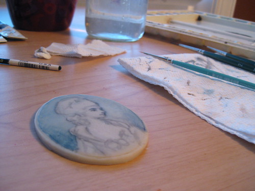
I rolled out the clay as smoothly as possible, and trimmed it to match the little frame that I have.  Since I wasn't sure which color would simulate ivory the most after baking, I made three different samples in: Ivory (natch), Winter Cream, and Translucent.  Oddly enough, Translucent came out a sort of clear, fleshy tone... way too pinky to be used for this sort of thing.  Winter Cream was a good color, but a bit too chalky in appearance.  Happily, the Ivory actually did look the most like ivory, and I set out to paint.

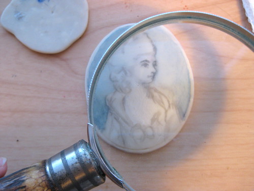
I started on a little shmushed piece that I'd baked as well, just to get a feel for the watercolor on this sort of surface.  Watercolor is persnickety at the best of times, but when you are applying it to a nearly totally non-absorbent surface it turns somewhat evil.  The most terrifying part which I found, is that even when the paint was dry, if you dripped water on it or added a wet wash, it lifted right back off again... just like it does on a palette.

This really hammered home to me why miniature painters nearly all employed a sort of stippled technique, as it is the least disturbing to paint already laid down.

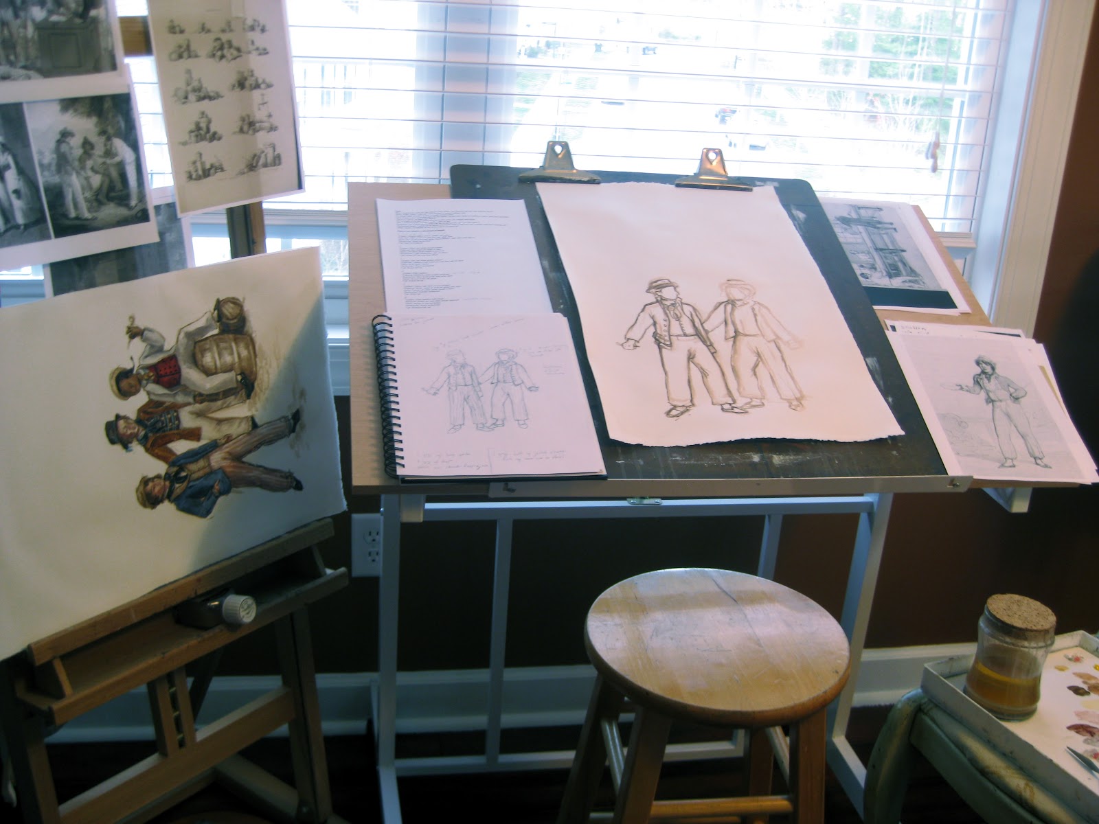
For the very first miniature, I decided to simply copy an original, as I'm not attempting to do anything other than get a handle on the medium.  So far I've merely done a light outline and started to lay in the background.  We'll see how it progresses...

Tuesday, March 29, 2011

Paintings of the lower sort- still in 1795!

Unless I decide to add backgrounds, the paintings are done. 

I worked quite a bit smaller than normal on these, using paper about 12x20 inches large for each piece, with the figures being approximately 6-9 inches tall.  That's about the size I normally like to paint faces.

One of the things that had impressed me about the original 1795 ad was how colorful so many of the garments described were.  I tried to get that same feeling of color in the paintings without it turning into a circus (though that would have been fun... late 18th cen circus... hmmm).  After all, how often do you ever run across yellow, purple, and white striped trousers?

clothes of the common man- 1795


clothes of the common man- 1795

clothes of the common man- 1795

These were all painted on rag paper primed with gesso, and, as per my usual, are done with oil paints.

Sunday, March 27, 2011

Common men sketches

When breaking down the list of clothing in the ad from 1795, it was decided to mix and match the garments on a variety of figures.  We settled on having six figures total spread across three separate illustrations.

Naturally, the first step of any project is to sketch it in order to work out general composition and provide a point of reference for the painting.  Depending on how good my reference images are changes how detailed the sketch is.


I shamelessly ripped off the pose from Thomas Rowlandson's Seaman for this one.  As it's in public domain, the only real issue at hand is my oftimes inherent laziness.  However, the point of this project is to depict the clothing, not to create pieces of fine art.  In this instance (like when doing costume renderings) I'm quite content to cut a few corners.

Once the sketches were approved and changes discussed, it was time for the actual paintings to begin...